

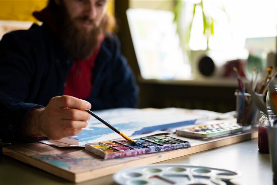
You’re standing in front of a shelf lined with rows of watercolour paints, each shade more tempting than the last. The colours shimmer with possibility, but you pause and wonder how to choose the right ones for your work.
It’s not selecting favourites; it’s choosing pigments that reflect the way you paint and what you’re trying to convey. No matter, if your style is soft realism, rich impressionism, or stark abstraction, your colour choices have to support and enhance that vision.
Every colour has specific qualities, and being aware of them can be the decisive element in your work. From how colours blend to how they move across the paper, each choice defines your artistic result.
Keep reading to discover how to make every choice count.
Contents
1. Understand Your Artistic Style
Before selecting colours, take a moment to define your artistic style. Are your pieces grounded in realism, loose and expressive as impressionism, or daring and conceptual as abstraction?
Knowing the direction can guide you right to the correct colour already in your palette. For instance, when working toward natural landscapes or still lifes, use earthy colours such as Yellow and Brown to establish depth and warmth.
If you do expressive work, use more saturated colours, such as Red and Yellow, to charge your compositions with energy and lightness. For dramatic works, use saturated colours such as Blue and Purple to produce strenuous visual declarations.
All in all, by aligning your colour choices with your creative vision, you ensure your watercolour palette actively supports your work rather than competing with it.
2. Consider Pigment Properties
Having established your style, your responsibility now is to become familiar with the individuality of each pigment. Not every watercolour paint is created equal, so you need to be discerning.
Begin by thinking about transparency and opacity. Transparent pigments, like Quinacridone Gold, can be used for subtle layering and glazing. Opaque pigments, like Cadmium Red, cover well but can overwhelm a blend.
Second, consider granulation—some pigments, such as Ultramarine Blue or Cobalt Violet, naturally fall into paper textures and provide texture and depth. These are wonderful if you like organic, expressive textures.
Third, consider staining strength. Staining pigments, such as Phthalo Green, dry permanent—fine for layering—but there is very little room for lifting. Non-staining pigments can be wet out again and erased, so you have room for highlights or corrections.
Ultimately, understanding pigments puts you in control of learning to more effectively command your techniques and choose paints best suited to your purposes as an artist.
3. Choose a Balanced Core Palette
Having learned how pigments behave, your next attention should be on building a core palette that provides balance, versatility, and harmony.
A sure starting point is the primary triad—one red, one yellow, and one blue. However, selecting warm or cool versions of these primaries has a tremendous impact on your mixes.
For a warm foundation, try Cadmium Yellow, Cadmium Red, and French Ultramarine. These make earthy-rich mixtures perfect for portraits or landscapes. In addition, for cold colours, replace Lemon Yellow, Alizarin Crimson, and Phthalo Blue, which yield fresh purples and rich greens.
After you’ve established your primaries, include some earth colours, such as Burnt Umber or Raw Sienna, so you don’t have to spend time mixing in foliage-loaded pieces.
You can also add a convenience green, such as Sap Green, so you don’t have to spend time mixing in foliage-loaded pieces. This central colour scheme serves as the foundation for your colours, offering both flexibility and consistency across subjects and painting styles.
4. Evaluate Mixing Potential
Now that you’ve built a foundational palette, it’s essential to test its mixing capabilities. A thoughtfully chosen limited palette should offer a broad range of secondary and tertiary colours without overwhelming you with too many options.
Start by asking key questions: Can your red and blue mix a rich purple, or does it turn muddy? Do your yellow and blue create a natural-looking green, or does it appear artificial? Can you neutralize colours to form greys or browns without adding black?
These tests are crucial because many painting scenarios require colour mixing rather than relying solely on straight-from-the-pan hues. A palette that blends cleanly across the spectrum gives you greater control over colour temperature, saturation, and harmony.
Spend time experimenting with colour charts and swatches, as this process reveals not only how well your colours interact but also which combinations best match your artistic goals. Effective mixing leads to confident, expressive painting.
5. Consider Portability and Format
Choosing the right palette also means thinking about where and how you paint. Your creative environment should influence your setup. If you typically work in a studio, you’ll have space for larger palettes, full pans, or tubes with ample mixing wells.
This allows for a broader range of pigments and easier access to water and brushes. In contrast, if you’re an urban sketcher or frequently paint outdoors (en plein air), portability is key.
Compact palettes with half pans, foldable mixing areas, and water brushes make travel easy without compromising on colour quality. Additionally, if you integrate your watercolour art into digital workflows, consider scanning your palettes and matching digital swatches for consistency across mediums.
The right format makes your practice more fluid and enjoyable, whether you’re painting a city street, a quiet forest, or from your desktop. Adapting your palette to fit your lifestyle ensures you’re always ready to create wherever inspiration strikes.
Conclusion
By now, you’ve learned how to choose a watercolour palette that perfectly aligns with your style, technique, and creative goals.
Whether you paint with the precision of realism or the freedom of abstraction, the right colours can elevate your work to new heights. Experiment, test, and refine because mastering your palette will ultimately help you unlock the full potential of your art.
Embrace the colours that speak to you, and start painting your masterpiece today!